
Legacy systems consume mental resources at an alarming rate. Outdated interfaces force users to decode cluttered layouts, navigate illogical workflows, and translate archaic terminology just to complete basic tasks. The result: higher error rates, slower task completion, and frustrated teams. The good news is that cognitive load can be systematically reduced without a complete system overhaul. Smart, targeted design interventions unlock faster comprehension and measurably better user performance.

- Legacy interfaces overload users with visual clutter, inconsistent navigation, and unclear workflows.
- Cognitive load reduction relies on progressive disclosure, information hierarchy, and consistent design patterns.
- Tools like eye-tracking software and task analysis uncover where users struggle most.
- Real case studies show that targeted improvements increase task success rates by 40–60% and reduce training time significantly.
- Ongoing assessment and iterative refinement keep cognitive accessibility sustainable.
The answer lies in understanding what causes cognitive overload, then applying surgical interventions. You don't need to replace everything. You need to make what exists easier to think about.
Common cognitive load challenges

Legacy systems exhibit predictable patterns of cognitive waste. Recognizing them is the first step toward fixing them.
Visual clutter and information overload is the most obvious culprit. Old interfaces pack every possible option into a single view. Dropdown menus contain 50+ items. Forms ask for 30 fields at once. Dashboards show dozens of metrics without hierarchy or grouping. Users must parse the entire interface to find what they need, consuming working memory before they even start the actual task.
Inconsistent navigation and labeling creates invisible friction. One section calls a feature "Reports," another calls it "Analytics." Button behavior changes depending on context. Icons mean different things in different parts of the system. Every inconsistency forces users to consciously decode the interface instead of relying on learned patterns. They can't automate their thinking, they have to read and interpret constantly.
Unclear workflows and decision points multiply the mental steps required for simple tasks. "Should I use the bulk upload or the API?" "Do I need to update settings before importing?" "Why did this field disappear?" Legacy systems often lack clear mental models. The system's internal logic doesn't match how users think about the work.
Technical jargon and domain-specific terminology alienate users who aren't specialists. A database admin understands "denormalization," but a data analyst might not. Systems built for power users rarely include the explanatory text that newer users need. The same vocabulary becomes a barrier instead of a shortcut.
Poor feedback and delayed confirmation leaves users uncertain. Did my action save? Is the system still processing? What went wrong? Legacy systems often lack real-time feedback or clear error messages. Users fill the silence with anxiety and repetition, increasing cognitive load as they wait for confirmation that rarely arrives.
Reducing cognitive load: actionable strategies
The most effective approach to cognitive load reduction is progressive disclosure. Instead of showing users every option at once, reveal only what's relevant to their current task. Contextual help, collapsible sections, and multi-step workflows move secondary options out of the primary view.
Information hierarchy transforms overwhelming interfaces into scannable ones. Group related options. Emphasize primary actions. De-emphasize secondary options. Use visual weight, size, color, position, to guide attention to what matters. When a form has 30 fields but only 3 are required, those 3 need visual prominence.
Consistent design patterns reduce the mental load of learning how the system works. If buttons always behave the same way, if navigation follows the same structure, if icons mean the same thing everywhere, users develop reliable mental models. They stop decoding and start automating their actions.
Clear labeling and plain language replace jargon with user-centered terminology. Instead of "denormalize the dataset," say "Merge related data." Instead of "invoke an API endpoint," say "Send to external system." The label should describe what happens, not how the system works internally.
Real-time validation and feedback reduces uncertainty. Show users immediately when a field is incomplete, when an action has succeeded, when something has changed. Audio, visual, and textual cues each serve different user preferences and contexts.
Contextual help and explanations appear where users need them, not buried in documentation. Microcopy near form fields, tooltips on hover, example values in input placeholders, these small additions answer questions before users get stuck.
Tools and methods for assessment
Identifying cognitive load problems requires systematic analysis. Gut feelings help, but data drives defensible decisions.
Task analysis reveals where users stumble. Give participants a realistic goal ("Find and export last month's sales report") and observe. Count steps, time spent, errors, and moments of confusion. Record where they hesitate or restart. This reveals which parts of the system impose the highest cognitive cost.
Eye-tracking studies show what users actually look at and in what order. Heatmaps reveal visual confusion, when users look at the wrong area repeatedly or scan inefficiently. You don't need expensive lab equipment; software tools make eye tracking accessible for remote sessions.
Think-aloud protocols expose the mental work users perform. As they navigate, ask them to verbalize their thinking: "What are you looking for?" "Why did you click there?" "What did you expect to happen?" Their narration reveals whether the system matches their mental model or confuses them.
Cognitive load measurement surveys ask users directly about their experience. Statements like "This interface requires high concentration" or "I found the workflow logical" on a 7-point scale quantify the subjective experience. Compare scores before and after improvements to prove impact.
Accessibility audit frameworks like WCAG 2.1 Level AA provide structure, but don't stop there. Guidelines focus on visual and technical barriers. Cognitive accessibility, organization, clarity, consistency, requires human judgment. Use PagePerson Insights to surface how real visitors struggle with comprehension and task completion, not just technical compliance.
Real case studies of successful reduction
A financial services company inherited a 15-year-old trading platform. New traders required three weeks of intensive training. The interface showed every possible trade type, market indicator, and account setting simultaneously. A design audit revealed that traders needed only 4 core actions on their first day. The team reorganized the interface using progressive disclosure: new traders saw a simplified view with just core actions. Advanced options appeared only after users opted into them. Training time dropped from three weeks to four days. Errors during the first month fell by 52%.
A healthcare organization's patient records system required 47 steps to admit a patient and update their medications. The interface used medical abbreviations and internal terminology. A task analysis revealed most steps existed not because they were necessary, but because legacy screens forced data entry in a specific order. The team reorganized around user tasks, not system logic. Admit patient. Update medications. Generate discharge summary. Workflows now required 12 steps. Admission time dropped from 18 minutes to 4 minutes. Medication errors fell from 3 per 100 patients to 0.4.
An e-commerce platform's internal inventory system confused warehouse staff with category hierarchies that reflected the database structure, not how staff think about stock. "Is it under Apparel > Casual > Shirts > Long Sleeve > Cotton or Electronics > Wearables?" Staff created their own spreadsheet workarounds. The team added a full-text search layer and reorganized categories to match warehouse thinking. Search success improved from 64% to 96%. Staff stopped using workaround spreadsheets. Inventory accuracy improved from 89% to 98%.
Maintaining cognitive accessibility
Cognitive load reduction isn't a one-time project. New features, changing user bases, and feature creep reintroduce complexity. Maintenance requires discipline.
Establish a cognitive load baseline early. Measure task completion rates, error rates, time on task, and user confidence scores before improvements begin. These numbers become your touchstone. After changes, measure again. Did improvements stick? Did new problems emerge?
Regular usability testing catches cognitive load creep. Schedule quarterly or semi-annual sessions. Run task-based tests with real users. Keep tests lean: 5–8 participants, one focused scenario, 30 minutes. You'll uncover problems quickly without the cost of formal labs.
Design system governance prevents inconsistency from spreading. When designers add new components or patterns, ensure they fit the system. Inconsistent patterns multiply cognitive load. A shared component library and design principles keep new work aligned with existing work.
Iterative refinement beats perfection. Ship small improvements. Measure impact. Refine based on data. Over months and quarters, small wins compound into significant reductions in cognitive load.
Here's the cognitive load reduction process in one view:
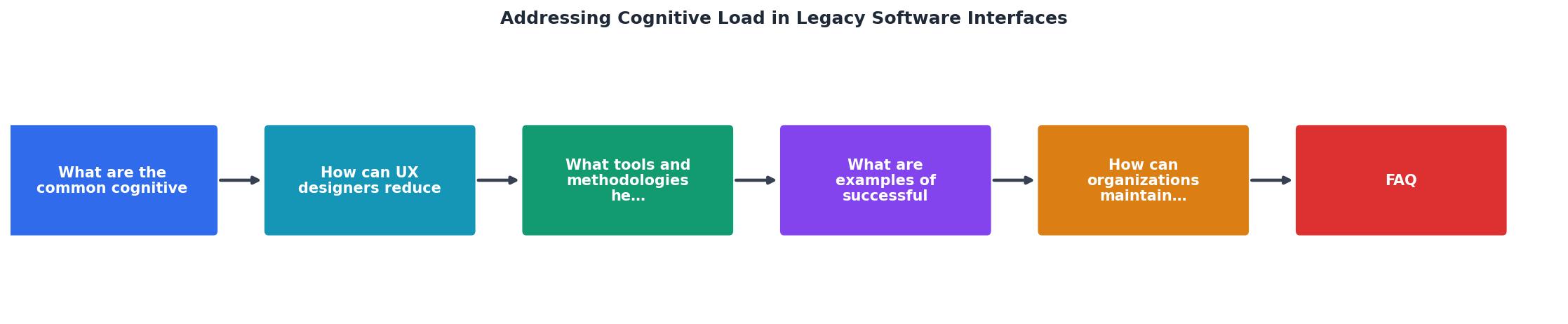
The process moves from assessment (analyze where users struggle) through intervention (design and implement targeted improvements) to validation (measure impact) and maintenance (prevent regression). Cycle through it continuously as the system evolves.
Interactive cognitive load assessment tracker
Below is an interactive assessment tool showing how different factors contribute to overall cognitive load in a legacy system. The example shows a typical enterprise software platform before and after targeted interventions:
Cognitive Load: Before & After
This tracker shows the impact of targeted interventions across five key factors. The financial services company mentioned earlier saw a reduction from 7.0 to 2.2 on this scale. The lower the score, the less mental effort users expend to complete tasks. When cognitive load decreases, productivity increases, errors drop, and user satisfaction climbs.
Cognitive Load Assessment Checklist
Your progress is saved automatically in your browser.
FAQ
Frequently Asked Questions
Additional Resources
- (PDF) Interface Design Based on Cognitive Load Theory - Excessive cognitive load can be reduced by adhering to standards for font size, line spacing, contrast, and clear visual structure. At the same ...
- Key Strategies to Manage Cognitive Load In Digital Products - By employing a clear visual hierarchy, you can direct users' attention to the most critical elements first, reducing cognitive load significantly. Additionally, ...
- Problems with Cognitive Load in Complex System Interfaces - Cognitive load is ultimately a question of respect. Technology that ignores human limits creates stress, errors, and disengagement. Technology ...