Cognitive Accessibility Essentials for SaaS Founders
Your SaaS landing page looks clean, your copy tested well with the team, and paid traffic keeps flowing in. Yet conversion rates sit stubbornly below expectations, and analytics show drop-offs you cannot explain. The missing piece is cognitive accessibility, the practice of designing interfaces that work for how human brains actually process information, including the roughly 15 to 20 percent of people with conditions like ADHD, dyslexia, or anxiety.

Your SaaS landing page looks clean, your copy tested well with the team, and paid traffic keeps flowing in. Yet conversion rates sit stubbornly below expectations, and analytics show drop-offs you cannot explain. The missing piece is cognitive accessibility, the practice of designing interfaces that work for how human brains actually process information, including the roughly 15 to 20 percent of people with conditions like ADHD, dyslexia, or anxiety.

- Cognitive accessibility directly impacts SaaS conversion rates because confused visitors leave, regardless of how good your product is.
- Reducing cognitive load through clear language, predictable layouts, and simplified flows can lift conversions without increasing ad spend.
- A practical checklist covering content clarity, navigation, error handling, and onboarding gives you a repeatable audit process.
Why cognitive accessibility matters for SaaS
Most SaaS founders think about accessibility as screen readers and color contrast. That covers visual and motor impairments. Cognitive accessibility addresses a different layer: whether a visitor can understand your page, hold instructions in working memory, make decisions without overwhelm, and recover from errors.
One in five adults has some form of cognitive or learning difference. That includes dyslexia, ADHD, autism spectrum conditions, anxiety disorders, and age-related cognitive decline. Even visitors without a diagnosed condition experience temporary cognitive impairment from stress, fatigue, multitasking, or using a phone in a noisy environment.
For a SaaS founder paying for every click, ignoring cognitive accessibility means paying to bring visitors to a page that actively confuses a significant portion of them. The fix is not charity. It is conversion optimization at its most fundamental level.
"The accessibility issues addressed in this guidance are essential for people with certain disabilities to be able to use digital technology.">, Cognitive Accessibility at W3C
How accessibility affects conversions

The connection between cognitive accessibility and conversion rates is straightforward: every point of confusion is a potential exit. Here is how it plays out in practice:
- Unclear value proposition on the hero section forces visitors to work harder to understand what you sell. Many leave instead.
- Complex pricing pages with too many tiers, footnotes, and conditional features overload working memory. Visitors defer the decision indefinitely.
- Dense onboarding flows with multiple steps, unfamiliar terminology, and no progress indicators cause trial users to abandon before activation.
- Error messages that use technical jargon or blame the user create anxiety and drop-off at checkout or signup forms.
Heatmaps show where people click. Session recordings show what they do. Neither tells you why a visitor stared at your pricing table for 40 seconds and then closed the tab. Cognitive accessibility analysis fills that gap. Tools like PagePerson Insights can surface these comprehension barriers directly, showing which elements on your page create confusion for real visitors.
Strategies to reduce cognitive load

Cognitive load is the total mental effort required to use your interface. Three types exist: intrinsic (the task itself), extraneous (bad design adding unnecessary effort), and germane (effort that builds understanding). Your job is to minimize extraneous load.
Here are concrete strategies that work for SaaS products:
- Use plain language. Replace "Leverage our proprietary algorithm" with "We find the best match for you." Every sentence should pass the "would I say this out loud?" test.
- Limit choices per screen. The paradox of choice is real. Three pricing tiers outperform five. One primary CTA per section outperforms three competing buttons.
- Create visual hierarchy. Size, color, and spacing should guide the eye. If everything looks equally important, nothing is important.
- Show progress indicators. Multi-step flows need a visible progress bar. Users tolerate longer processes when they know where they stand.
- Write descriptive button labels. "Get started free" beats "Submit." "See pricing" beats "Learn more." The label should predict the outcome.
- Chunk information. Break long pages into scannable sections with clear headings. Use bullet points for lists of three or more items.
| Low Accessibility Approach | High Accessibility Approach |
|---|---|
| Wall of text on landing page | Chunked sections with clear headings |
| "Submit" button labels | "Start your free trial" labels |
| 5+ pricing tiers | 3 tiers with clear differentiation |
| Technical jargon in error messages | Plain language with recovery steps |
| No progress indicators in onboarding | Step counter showing "Step 2 of 4" |
Implement accessibility features

Implementation does not require a full redesign. Start with the pages that matter most for revenue: landing page, pricing page, signup flow, and onboarding.
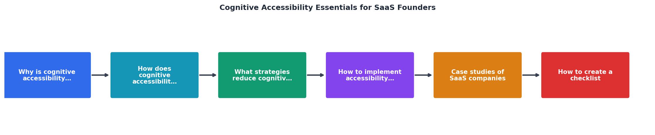
Follow these steps in order: Audit, Prioritize, Fix, Test, Monitor.
- Audit your top five pages for readability, layout complexity, and interaction patterns. Use automated tools for readability scores and manual review for flow logic.
- Prioritize fixes by revenue impact. A confusing pricing page costs more than a confusing blog post.
- Fix the highest-impact issues first. Rewrite unclear headlines. Simplify form fields. Add progress indicators to multi-step flows.
- Test changes with real users. Even five usability sessions reveal patterns. Include participants with diverse cognitive profiles.
- Monitor ongoing performance. Conversion rate changes, time-on-page shifts, and form completion rates all signal whether your fixes work.
- Consistent navigation across all pages. Users should never wonder how to get back.
- Forgiving input fields that accept multiple formats (phone numbers with or without dashes, dates in various formats).
- Inline validation on forms so users fix errors immediately, not after submitting.
- Timeout warnings with the option to extend. Timed sessions create anxiety for users who process information slowly.
- Clear typography with sufficient line height (1.5x minimum), adequate font size (16px base), and high contrast ratios.
SaaS companies getting it right
Several SaaS companies have made cognitive accessibility a competitive advantage:
- Basecamp built its entire brand around simplicity. Their landing page uses short sentences, one CTA, and minimal visual noise. The result: consistently high conversion from organic traffic.
- Notion invested heavily in progressive disclosure. New users see a simple interface that reveals complexity gradually, reducing initial cognitive load during onboarding.
- Stripe redesigned their documentation with readability as a core metric. Code examples appear inline, language stays plain, and navigation is predictable. Developer activation rates improved as a direct result.
- Mailchimp simplified their campaign builder by reducing the number of decisions per screen. Each step asks one question. Their onboarding completion rates reflect this focus.
The following card shows example metrics a SaaS founder might track before and after implementing cognitive accessibility improvements:
Accessibility Impact Dashboard (Example)
Cognitive accessibility checklist
SaaS Founder's Cognitive Accessibility Checklist
Your progress is saved automatically in your browser.
FAQ
Frequently Asked Questions
Additional Resources
- Cognitive Accessibility at W3C - This page introduces: accessibility for people with cognitive and learning disabilities (“cognitive accessibility”) memory, language, attention,
- Cognitive Accessibility Essentials for a More Usable Web - Embark on a journey of cognitive accessibility mastery! Discover essential tips for creating user-friendly digital experiences.
- Unlocking the Power of Accessibility in SaaS Design - Accessibility is about ensuring that your SaaS product can be used by everyone, regardless of their physical or cognitive abilities.
Need Help with Accessibility?
Improve your site's accessibility and conversion rates with our AI-powered analysis.
Get Started