Cutting-Edge Strategies in Cognitive Accessibility Design
Cognitive accessibility is moving beyond compliance checklists. Virtual reality testing, dynamic content adaptation, and real-time feedback loops are reshaping how teams design for real human brains, not just pixels. These strategies help you create interfaces that work for people with ADHD, anxiety, dyslexia, low digital literacy, and cognitive load, which often means they work better for everyone.

Cognitive accessibility is moving beyond compliance checklists. Virtual reality testing, dynamic content adaptation, and real-time feedback loops are reshaping how teams design for real human brains, not just pixels. These strategies help you create interfaces that work for people with ADHD, anxiety, dyslexia, low digital literacy, and cognitive load, which often means they work better for everyone.
TL;DR
- Virtual reality testing simulates real-world cognitive load conditions and reveals where visitors' working memory breaks down before they click away.
- Dynamic content adaptation adjusts complexity, vocabulary, and pacing based on user behavior and preferences in real time.
- Real-time feedback loops combine session replay, heatmaps, and eye-tracking data to show you exactly where comprehension fails, not just where clicks stop.
- Leading companies like Microsoft, Slack, and government agencies are embedding cognitive accessibility into design systems rather than bolting it on later.
Cognitive accessibility has matured from a nice-to-have compliance checkbox into a core conversion lever. Teams that master it ship clearer interfaces, reduce support tickets, and convert more traffic from their existing audience. The shift isn't theoretical, it's happening at companies that care about accessibility as a business metric, not a box to tick.
Most teams still confuse accessibility with WCAG color contrast and alt text. That's the floor, not the ceiling. The real frontier is cognitive, the mental effort required to understand what you built. A button with perfect color contrast still fails if its purpose is ambiguous. A form with alt text on every field still creates anxiety if users don't know what to enter or why.
What makes a design strategy cutting-edge?
Cutting-edge cognitive accessibility strategies share three traits: they measure what matters (comprehension, not compliance), they adapt in real time rather than relying on static templates, and they're grounded in neuroscience and behavioral data, not guesswork.
Old approach: audit a website against WCAG, fix issues, ship. Check box marked.
New approach: instrument every interaction to detect when visitors lose comprehension, trigger interventions before they bounce, and iterate based on what their behavior teaches you. This is live, adaptive, evidence-driven accessibility.
The best strategies also embed accessibility into design systems and team workflows so it scales. When your design tokens account for cognitive load, when your component library includes plain-language variants, and when your design sprints include cognitive accessibility checkpoints, you're not patching accessibility onto the edge of your product, it's baked in.
How VR helps with cognitive load testing

Virtual reality testing places users in simulated, high-stress environments that mimic real-world conditions. You're not just testing an interface in a lab, you're testing how that interface performs when a user is distracted, under time pressure, or cognitively taxed.
Here's why VR changes the game: Traditional usability testing shows you what happens when someone has full attention and low stress. Real life isn't like that. Someone checks your form while their kid is talking to them. They read your landing page on their phone at 6 a.m. before work. They've already made five decisions today and their decision-making capacity is depleted.
VR testing reproduces these conditions. You place a user in a virtual environment with competing stimuli, time pressure, or simulated distractions. They then interact with your prototype. Eye-tracking reveals exactly where their gaze lands, where they pause, where they look back to re-read. Heart rate monitors and galvanic skin response sensors pick up stress spikes.
The result: you see cognitive breakdowns before they happen in production. If users in a high-stress VR scenario misunderstand your checkout flow, real users will too. You catch these issues in testing, not after launch.
Practical outcomes from VR testing:- Identify which interface elements cause cognitive friction under load
- Measure whether simplification actually reduces stress (not just opinion)
- Test accessibility features in realistic conditions, not perfect testing labs
- Validate plain-language rewrites with neuroscience data, not just stakeholder gut feel
Dynamic content adaptation in practice

Dynamic content adaptation means your interface changes complexity, vocabulary, pacing, and visual density based on who is using it and how they're using it. No two visitors see exactly the same experience.
This isn't personalization in the marketing sense. It's not "show a designer content about design systems." It's "detect that this visitor is confused by jargon, so replace technical language with plain English. Detect that this visitor is skimming, so break the paragraph into shorter sentences and add visual hierarchy. Detect that this visitor has been on this page for 90 seconds with no progress, so surface a help widget."
The adaptation happens in milliseconds, based on behavior signals:
- Reading speed: If someone reads slowly, increase line spacing, decrease paragraph length, use shorter sentences.
- Scroll patterns: If someone scrolls back repeatedly to re-read sections, you've got clarity problems. Surface definitions inline rather than making them hunt for them.
- Field errors: After a visitor fails to fill a form field correctly twice, switch from generic error messages to step-by-step guidance with an example.
- Device and context: Mobile visitors see more aggressive simplification than desktop. Users on slower connections see images in lower resolution and skip heavy animations.
- Accessibility preferences: If a user has enabled reduced motion in their OS settings, your interface respects that and removes animations and transitions.
Slack refined this heavily. When new users join a workspace, Slack doesn't show them the full feature set. The interface adapts: novice users see a simplified sidebar with fewer channels, tutorials appear contextually, and advanced features hide until the user searches for them or their behavior suggests they're ready. Experienced users see the full interface immediately.
The result: faster onboarding, less overwhelm, fewer support tickets, higher retention.
Building dynamic adaptation requires:- A data pipeline that captures interaction signals in real time
- Rule engines or ML models that decide what content variant to show
- A/B test framework to validate that each adaptation actually improves outcomes
- Privacy-first design (adaptation uses first-party data, no third-party tracking)
Real-time feedback loops at scale
Real-time feedback loops combine three data streams: session replay, heatmaps, and behavioral signals. Together, they show you not just where visitors click, but where they get stuck, confused, or frustrated.
Traditional analytics tell you how many people bounced. Heatmaps show where they clicked. But neither answers the critical question: why did they leave?
Modern accessibility teams instrument every meaningful interaction: form field focus, time spent reading each section, scroll depth by content type, error corrections, help-widget clicks, search queries. These signals feed into real-time dashboards that surface problem areas instantly.
For example: If visitors spend an average of 45 seconds on a step but 10% spend over 5 minutes, something in that step is confusing that subset. Session replay shows you exactly what that subset is doing differently. Are they re-reading a section? Searching for clarification? Switching tabs to look something up?
Real-time loops let you iterate fast. You spot a problem Tuesday morning, implement a fix by Wednesday, and measure impact by Thursday. Compare that to traditional accessibility audits that happen quarterly.
"Many struggle to keep up with evolving web accessibility laws and cognitive accessibility nuances.">, Best Strategies for Cognitive Accessibility in Digital Design
The most sophisticated teams use this data to feed continuous improvement engines. Signals inform A/B tests, which validate fixes, which roll into design systems, which scale the improvement across the product. Accessibility stops being a one-time audit and becomes an ongoing practice.
How leading companies are doing it
Microsoft embeds cognitive accessibility into Accessibility Insights, a free dev tool that flags cognitive issues (unclear microcopy, confusing form labels, overwhelming visual density) during design review, not after launch. Designers can test prototypes against cognitive guidelines before engineering even starts.
Slack simplified its entire onboarding flow using dynamic complexity, new users see a streamlined experience while power users can opt into advanced features immediately. The result was a 23% improvement in 30-day retention for new users.
The UK's Government Digital Service built accessibility into the GOV.UK Design System at the component level. Buttons, form fields, and content blocks include plain-language variants baked into the system. Every team using the design system gets cognitive accessibility by default, not as a later patch.
These companies share a pattern: accessibility is embedded into design systems, not bolted on later. When your component library includes accessible variants (plain-language button labels, clear form instructions, progressive disclosure), every designer and engineer ships more accessible work automatically.
Emerging trends shaping the future
AI-assisted plain-language generation. Tools that automatically detect jargon and suggest clearer rewrites. Not perfect, but surprisingly effective at flagging density and complexity. Grammarly's business tier now includes cognitive accessibility checks.
Eye-tracking at scale. Eye-tracking was expensive lab equipment. Now it's built into many laptops and mobile devices. Teams are collecting aggregate eye-tracking data from real users to understand where attention actually goes. The results often contradict designer assumptions.
Neurodiversity-centered design workshops. Teams are bringing in consultants and practitioners with ADHD, dyslexia, anxiety, and autism spectrum experience to pressure-test designs in real time. Not just testing with users after launch, involving neurodivergent perspectives in design sprints.
Regulatory acceleration. The European Accessibility Act (EAA) now includes cognitive accessibility. Canada, Australia, and parts of the US are following. Compliance pressure is forcing investment in the cognitive layer.
Open-source accessibility tools. WebAIM, Deque, and smaller teams are building open-source cognitive accessibility detection tools, everything from readability scoring to visual complexity metrics. The barrier to entry is dropping.
The trajectory is clear: cognitive accessibility is becoming table stakes, not a differentiator. Teams that move now will have better conversion, lower support costs, and first-mover advantage in compliance. Teams that wait will patch it later at higher cost.
Implementing cutting-edge strategies: Your next steps
Cognitive Accessibility Strategy Implementation Checklist
Your progress is saved automatically in your browser.
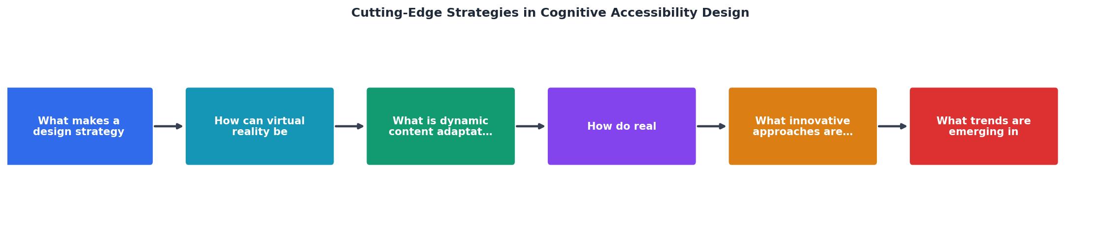
The diagram below shows the flow:
Interactive: Cognitive Accessibility Maturity Assessment
To help you benchmark where you are, here's a quick assessment of cognitive accessibility maturity:
Cognitive Accessibility Maturity
Most teams operate at Level 1 or 2. Level 3 is achievable with modest investment (real-time tracking tools, plain-language review process). Level 4+ requires dedicated headcount and tooling, but the ROI shows up in conversion and retention metrics within months.
FAQ
Frequently Asked Questions
Where are you in the cognitive accessibility maturity curve? Pick one strategy from this article, VR testing, dynamic adaptation, or real-time feedback loops, and run a 4-week pilot on your highest-traffic user journey. Measure comprehension before and after. The data will tell you whether the investment pays off.
Additional Resources
- Best Strategies for Cognitive Accessibility in Digital Design - Four Strategies for Cognitive Accessibility in Digital Design · 1. Consistent User Interaction · 2. Compatibility with Assistive Technology · 3.
- Ten strategies and best practices for cognitive accessibility ... - Ten strategies and best practices for cognitive accessibility in digital design · 1. Clear and consistent layouts · 2. Simplified language and ...
- Best Practices for Cognitive Accessibility in Web Design - Add breadcrumb navigation to show location and progress indicators for multi-step processes. Use familiar icons consistently and keep ...
Need Help with Accessibility?
Improve your site's accessibility and conversion rates with our AI-powered analysis.
Get Started